


Understanding how to trade using supply and demand zones undoubtedly took my trading to the next level.
For the next several weeks I plan on covering various topics of supply and demand that will not only help you trade better but also read price action with more accuracy.
In theory, supply and demand explains the interactions of buyers and sellers of a given asset/ or product.
At its core, supply and demand combines economic principles that describe how changes in the price of a commodity affect its “supply” and “demand” within the market.
When something is seen as “expensive”, there will be fewer willing buyers.
Therefore, there is a surplus of sellers versus buyers in the market.
In other words, there are more people inclined to sell when prices are high than there are people willing to buy when prices are high.
When something is seen as “inexpensive” or at a discount, we get the opposite.
Now we have more willing buyers in the market who want to buy while prices are “inexpensive” which will in turn decrease the amount of supply that is available.
One thing I will add is that my entire trading strategy revolves around supply and demand. If you can understand how to read supply and demand using a candlestick chart, then you literally have everything you need to become a successful trader.
Now let’s get into the fun stuff:
How To Draw Supply/ Demand Zones
It all starts with ranges.
A range in trading is viewed as “side-ways” price action where price is not making any new significant highs or new significant lows, but rather bouncing back and forth between two levels of support and resistance. As shown below:
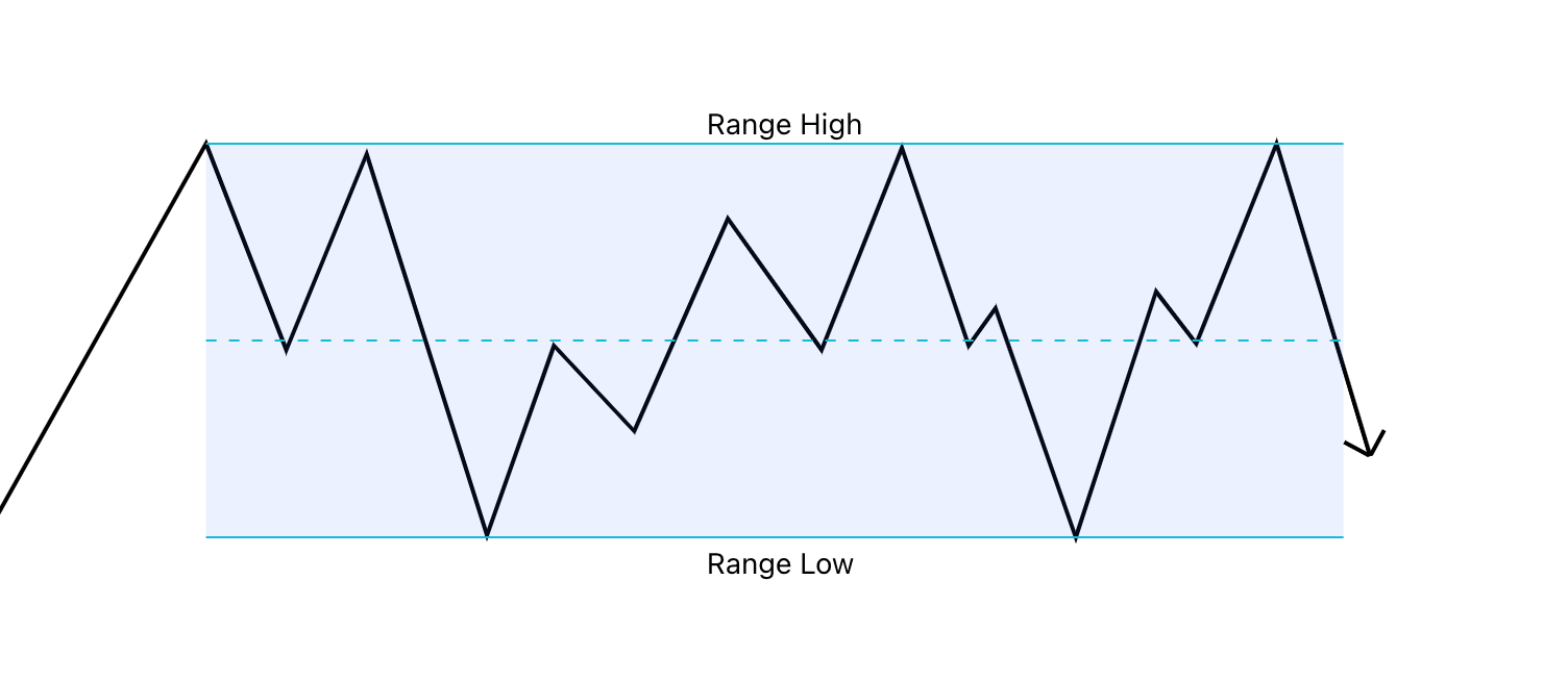
When price action is ranging, it can be said that price has temporarily found “fair value”. This could further be interpreted to mean that the market has, for the time being, identified price areas that indicate when an asset is “over bought” and when that asset is “over sold”.
When an asset becomes over bought, sellers’ step into the market, resulting in a drop in price. When an asset becomes over sold, buyers step into the market, resulting in an increase in price.
This pattern is expected to continue within the range until one side gains control and price breaks out either to the upside or the downside.
In the example above, you can see that every time price reached the “Range High”, aka over-bought zone, price dropped. While every time price reached the “Range Low”, aka over-sold zone, price rapidly increased.
A range can be classified in two ways:
Accumulation
Distribution
Accumulation & Distribution
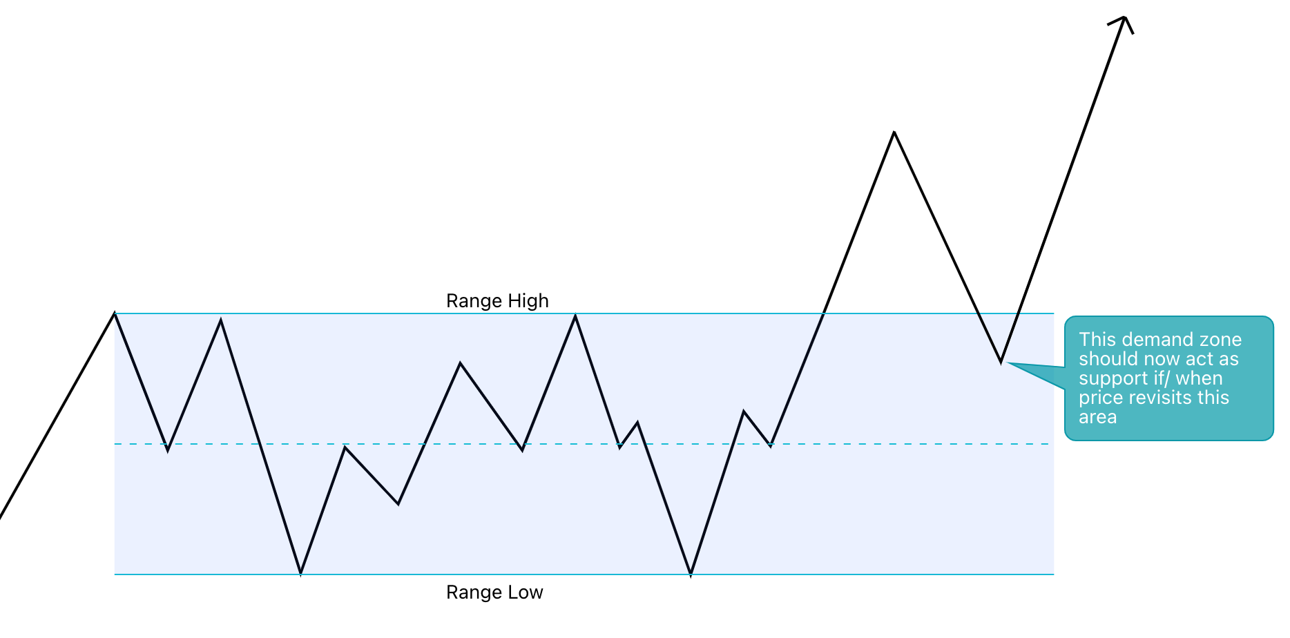
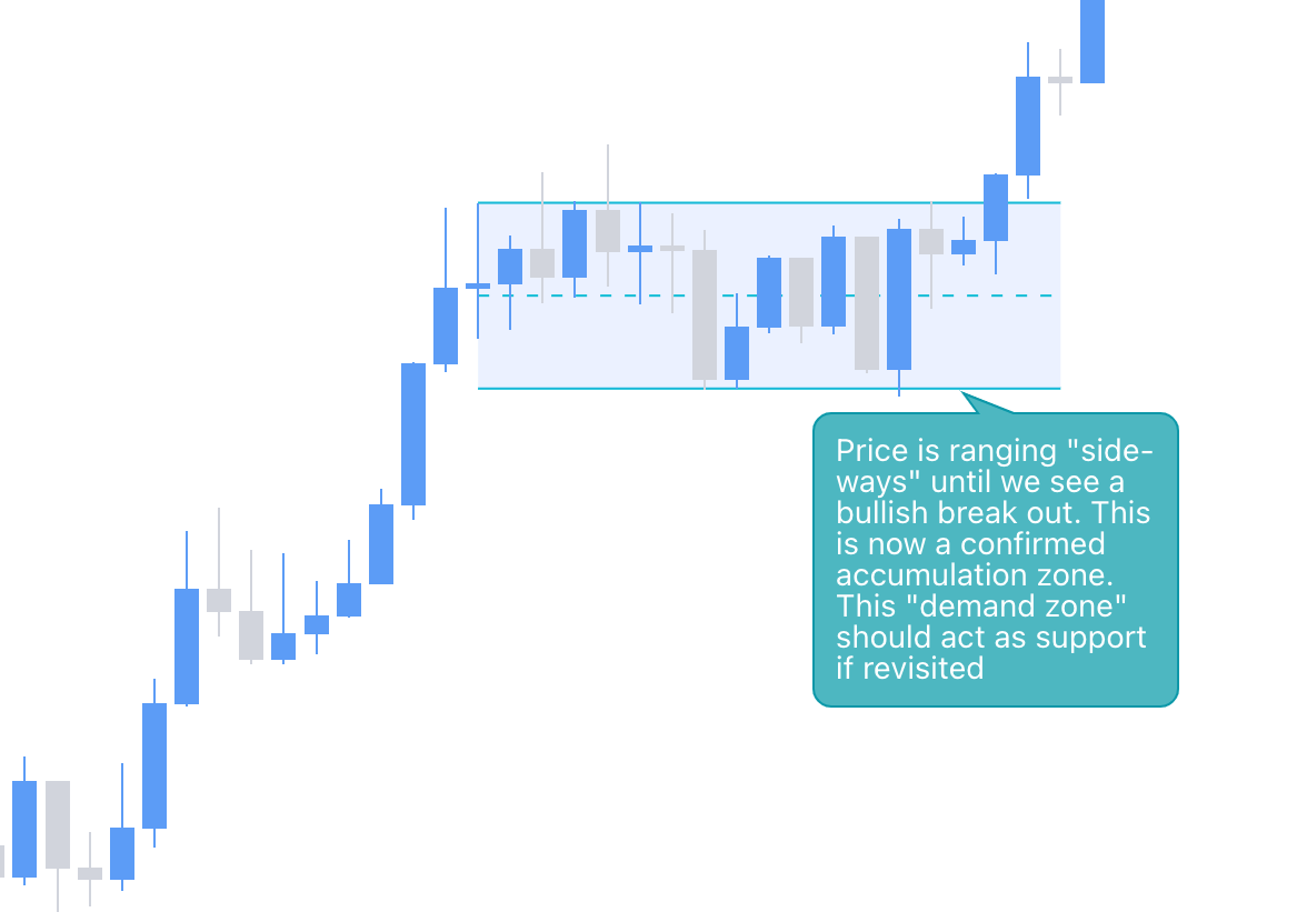
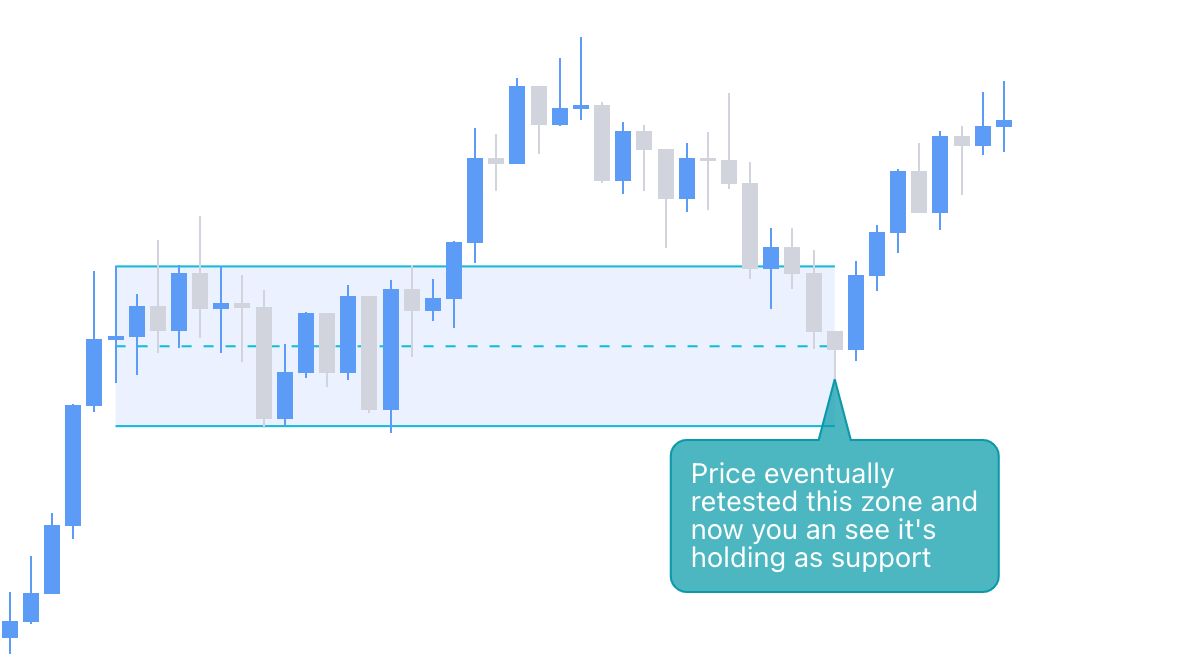
The direction in which a range breaks out ultimately dictates whether the range is an accumulation range or distribution range.
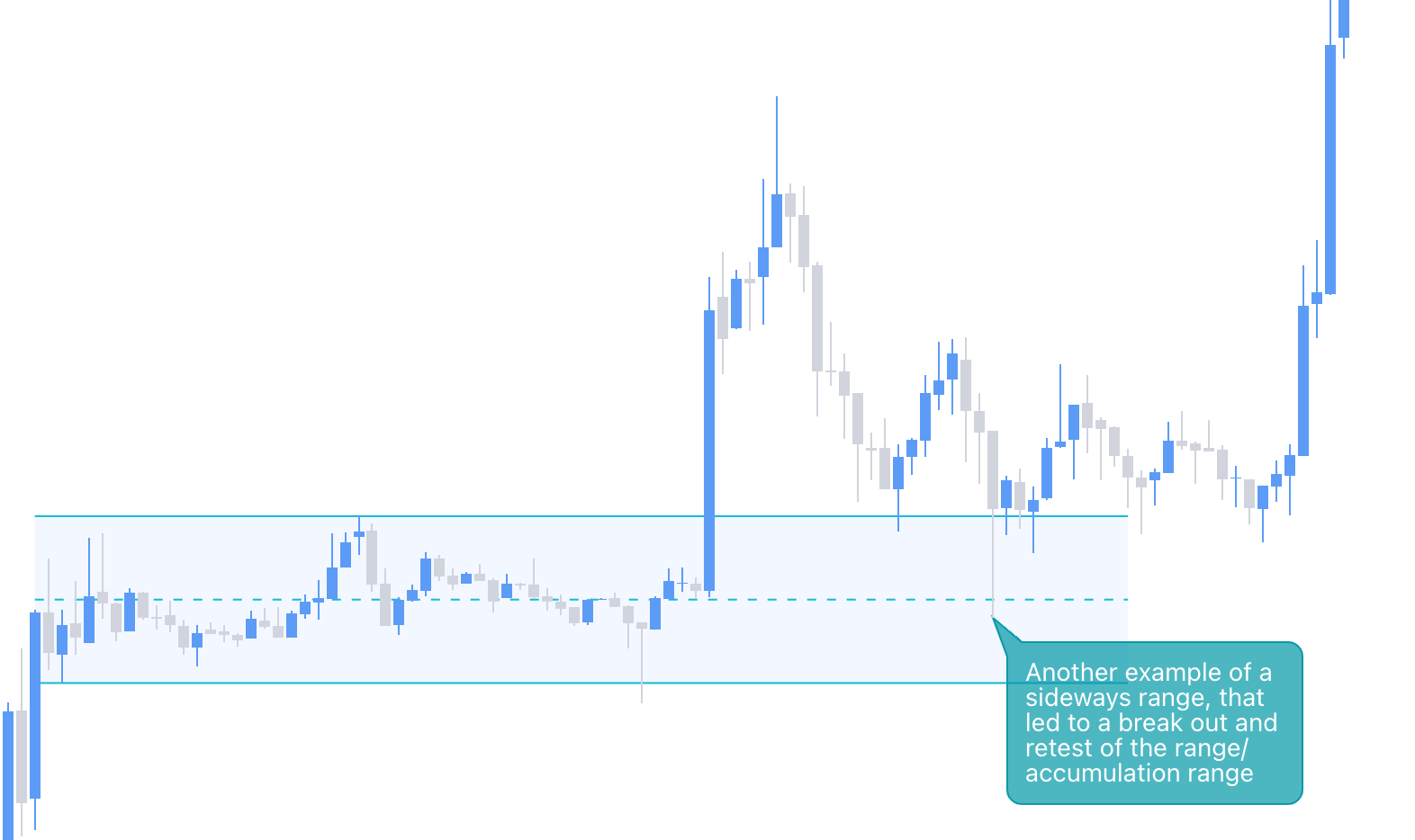
Accumulation represents an area of implicit “buying”.
If price breaks out of a range to the upside, then it can be said that market makers were accumulating price at a fair value before an imminent breakout.
With that being said, you can then imagine that all of the selling that took place within the range was being absorbed by larger buy orders until price eventually broke out to the upside.
Another word for an accumulation range is a “demand zone”.

An accumulation range (demand zone) is then expected to act as support if/ when price revisits this area.
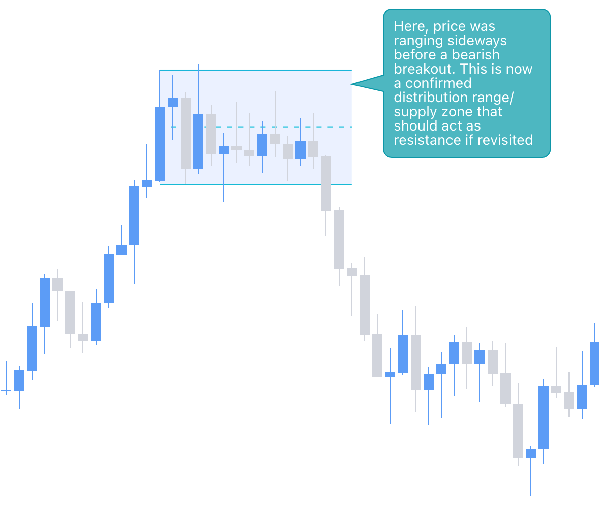
Distribution represents an area of implicit “selling”.
If price breaks out of a range to the downside, then it can be said that market makers were distributing price at a fair value before an imminent breakout.
With that being said, you can then imagine that all of the buy that took place within the range was being absorbed by larger sell orders until price eventually broke out to the downside.
Another word for a distribution range is a “supply zone”.

A distribution range (supply zone) is then expected to act as resistance if/ when price revisits this area.

A breakout of a range will usually lead to an imbalance of supply or demand.
Often times price will return to the range in order to reestablish order flow, or in other words, fix the imbalance that was created during the initial breakout.
Let’s go over some examples on the chart:

How To Refine Your Zones
Now that you can hopefully understand that supply and demand zones are derived from ranges (accumulation vs. distribution), we can finally start looking for ways to refine these zones into something we can actually trade from.
There are several ways you can refine a supply/ demand zone:
Sell-Before-Buy (SBB) or Buy-Before-Sell (BBS) Pivot Zones
Candle Pivot Zones
Wick Zones
Buy-Before-Sell (BBS) Zones

Referring to the image above:
On the left you have a side-ways range that eventually broke out to the downside. This now confirms that sellers were in control and this range is now a confirmed distribution range that should act as supply/ resistance if revisited.
If price does revisit this zone, it would help to know exactly how to refine this large range into a smaller zone that you can trade from.
The image on the right is the Buy-Before-Sell Pivot Zone (BBS).
When looking to refine your zone, look for the last area in the range where buyers stepped in before the breakout — this is now your BBS Zone.

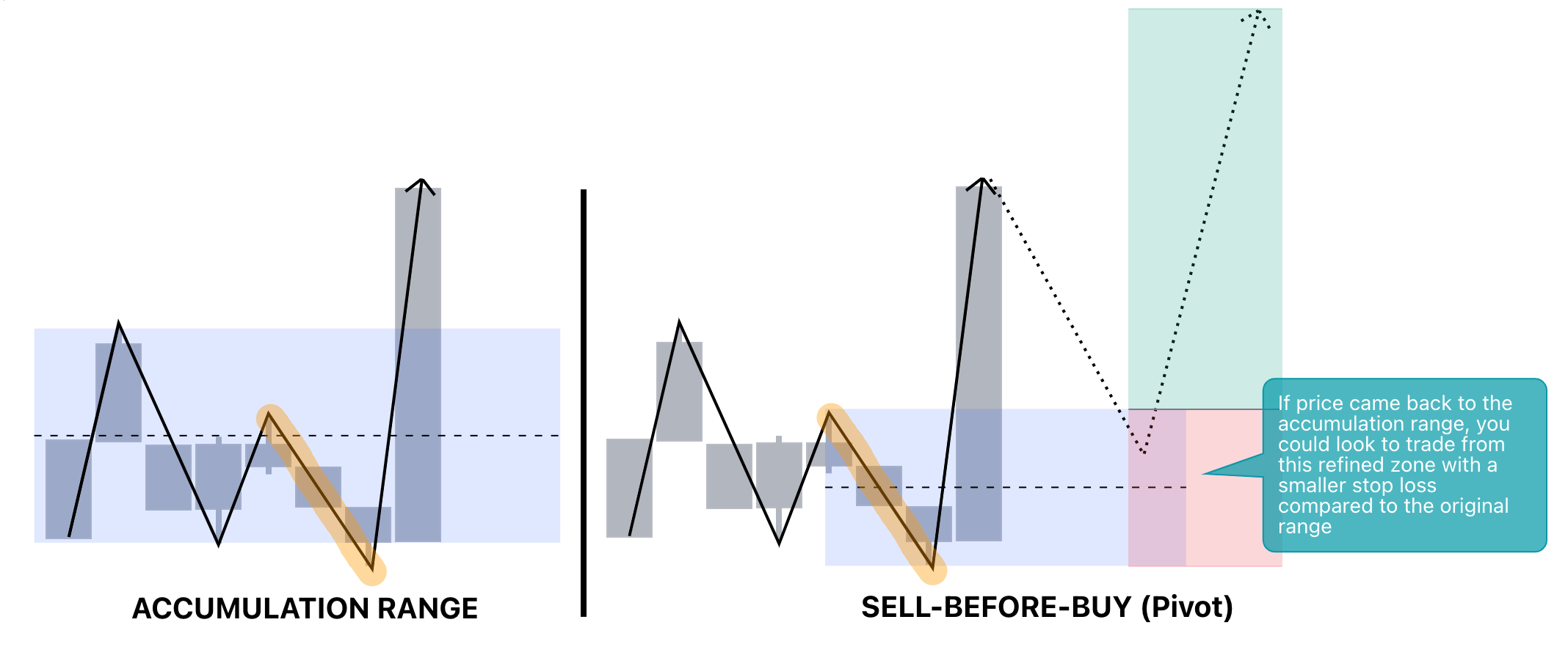
Sell-Before-Buy (SBB) Zones

Referring to the image above:
On the left you have a side-ways range that eventually broke out to the upside. This now confirms that buyers were in control, therefore this is a confirmed accumulation range that should act as demand/ support if revisited.
As mentioned above, knowing how to refine your zones is going to be key in finding quality trades/ points of interest (POI).
The image on the right is the Sell-Before-Buy Zone (SBB).
When looking to refine your zone, look for the last area within the range where sellers stepped in before the breakout — this is now your SBB Zone.
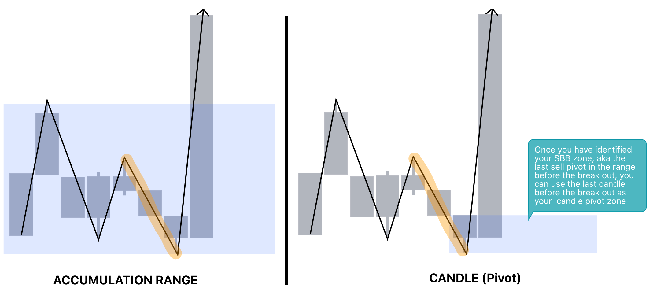
Candle Zones
Much like your BBS/ SBB zones, candle zones allow us to refine our supply/ demand zone even further.
Candle zones are the most popular zones used withing supply and demand. The reason being, that they are quite easy to spot, and often times give you a high Risk-to-Reward trade set up.


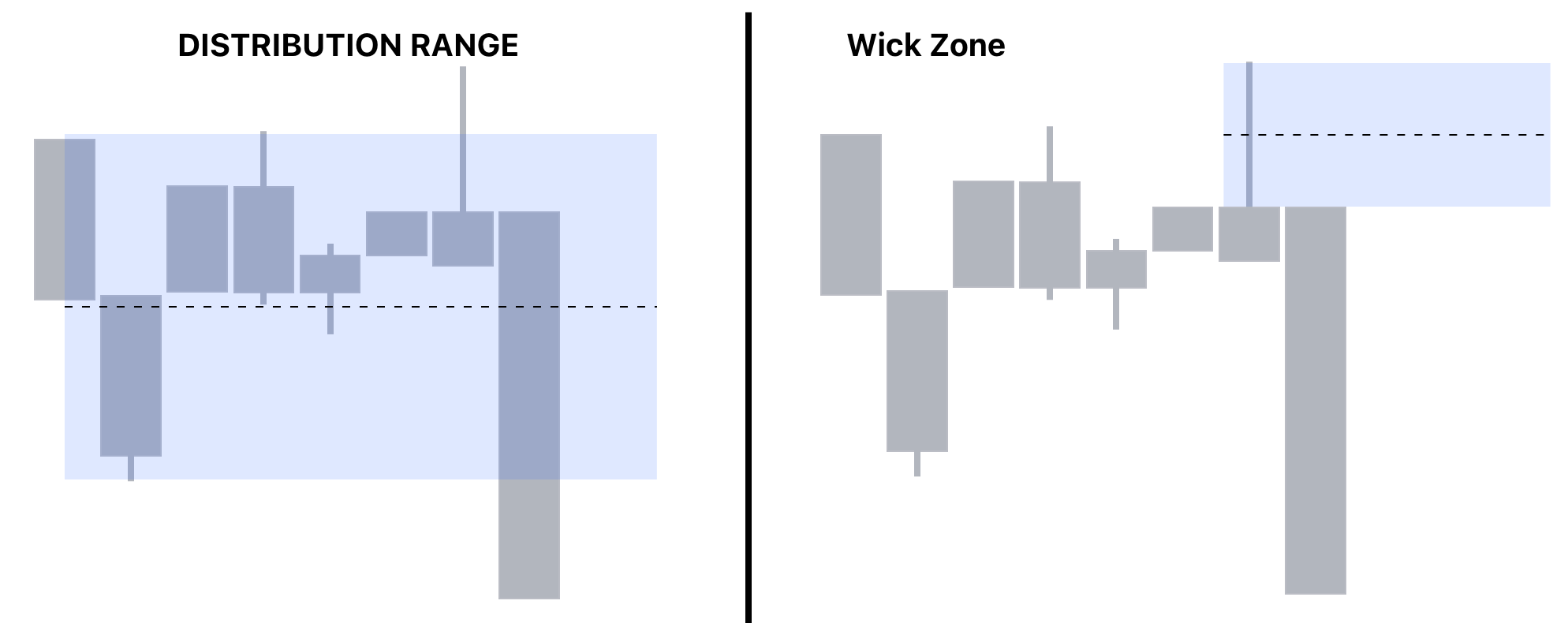
Wick Zones
Last but not least — we have our wick zones.
Wick Zones are usually the last line in the sand and will usually provide the highest R:R when trading, however something to keep in mind is that price doesn’t always pull back into wick zones.
For that reason, I usually only reserve wick zones for hammer candles or anything that usually has a smaller body relative to the wick.
Nonetheless, it still helps to have your wick zone labeled.
To continue this lesson, check out the video tutorial above where I go over live chart examples of how to draw and refine your supply and demand zones in more depth.
Don’t forget to subscribe to make sure you don’t miss out on part two of my supply and demand zone series.
As always, thank you all for your support!
Mr. E
